statement of intent
This project 'Landscapes' is a collective of photos and comparison between photos of different environments. I aim to depict the differences and uniqueness of each of the separate areas. At the end of the project I will decide which of the photos is the best from the places and I will compare and contrast them.
For my initial research I will locate different environments that are complete opposites to each other, seascapes and urban, two different locations. The two artists I have interest in is Paul Shears and Berenice Abbot. The reason I decided to do this is because they are both from different timescales and eras. This will show a greater understanding and development as I try to cater my photographs to present and past timescales. It is a greater challenge as both of the two have very different mindsets and photo styles.
When I chose this theme I decided that to get into further depth and development I must choose different landscapes to enhance the range of landscapes so I can compare and contrasts what makes each landscape unique.
To show development and progression I must be able to purvey photos in styles of different timescales to understand and acknowledge what makes cityscape and seascape photography unique. It will portray that I have really thought about how to make a exceptional photo using angles, composition and a variety of different filters.
I would like to experiment with composition and perspectives, with addition to black and white filters. I want to use perspectives such as worms eye view, to portray the world in a different manner than what we see in our daily acquaintances, I feel this will augment my work and boost my knowledge and understanding of the project.
During this project I will conscientiously analyse and critic my own photographs as I continuously look to improve and mimic the style of photographers from different eras as I feel ultimately this will invigorate my knowledge and understanding of the Landscapes project.
Mindmap - seascape & urban

Viewpoints - example analysis

This image is a worms eye view of three skyscrapers. In the photo the photographer uses viewpoints to make the photo more exquisite. The photo is taken in the perspective of a worms eye view, which helps the viewer to realise how colossal the skyscrapers really are. Using the three buildings in conjunction together makes the building resemble a tunnel, with the light of the sky where the birds are flying over, being the light at the end of a tunnel. The photographer uses a black and white filter on the photo. The effect of this is that it detracts the standing out colours away from the photograph so the viewer of the photograph can focus on the photographers intentions which is portraying the height of the skyscrapers and the tunnel effects they create.
The photographer makes the photo slightly over exposed, you can see this by looking at the clouds as they are bright white. Personally I think he does it for the tunnel effect, if the photo was perfectly exposed the sky would be grey, so it wouldn't look like a light at the end of a tunnel and therefore it would not be a tunnel effect. There is a perfect use of shapes in the photograph as every one of the buildings have a unique structure and character to them therefore the viewer is attracted to each of the buildings equally as they are all unique in their separate ways and catch the viewers attention.
Personally I like this photo as it easily attracts your attention and uses perspective and compositions effectively. The worms eye view makes the photo appealing and makes it stand out, and making the photo with a black and white filter makes your attention towards the height and scale of the photo, and the black and white filter helps you detract from the irrelevant details.
Anglesey ,wales
For a true seascape I decided Anglesey, Wales would be the perfect place to take photos for a coastline landscape that is a direct contrast of a cityscape. Photos of seascapes in particular are exceptional as they include a horizon which adds a vanishing point to the photos.


anglesey - best photo

This is my favourite photo that I took in Anglesey. it focuses on the horizon using it as a vanishing point. it is a portrait for the theme of seascape photography. I like this photo mainly because it is a direct contrast for my urban landscapes. It depicts the environment of seascapes compared to the close, clustered urban landscapes that focuses on architecture as its main theme. The photo was taken with a deep depth of field, it helps to delineate the horizon and the vanishing point. The rock formation in the background is placed on a power spot to help attract the viewers attention to the photograph. I aimed to get the horizon directly horizontal as this makes the viewer able to follow their eyes into the horizon, which is ultimately the vanishing point of the photo.
Anglesey - worst photo

This is the worst photo I taken at Anglesey. It was meant to depict the size of the rock formations with the glimmer of the sunset, but the photo didn't come out as expected. The rock formation does not line up on a power spot and therefore does not track the viewers attention. The photo is not horizontally straight therefore it is slightly slanted and not look as aesthetically pleasing. Next time I would line up the picture perfectly, zoom out a bit more as it is too focused on the rocks, and get more of the horizon into the picture instead. This would make the photo more appealing as it zoomed in so much it sort of gives the viewer a tunnel vision look as it is too focused on one point.
photoshop - anglesey


Anglesey -Final photoshop


|


|
These are the final Photoshop's I have created for Anglesey. My problem is that it doesn't necessarily follow the theme of black and white, it contrasts directly to that and looks more pop art. I tried and tested a black and white theme but I found it was not suitable for this type of image. After testing I found that bumping the saturation up to max and adjusting the hue slider, you can get a really effective pop art look with changing colours as you adjust the slider. I decided instead of one photo that is a different colour, why not make 4 different contrasting colours and collage them? that's exactly what I did. And this was the outcome. Even if it does not follow my black and white theme I am still very impressed on it's outcome so I decided to post it on the website.
In particular I love how mixing the saturation and hues alter the colour of the sea and sky in particular. it creates this supernatural feeling as you start to see different patterns in the sky that weren't visible before and it creates a sense of surprise as when you see the photos in these different colours you treat is a whole separate photo is at is completely different as you change the colours.
Anglesey Photoshop 2.0 - horizon


aNGLESEY HORIZON - FINAL PHOTO

Personally, this is my favourite Photoshop edit for Anglesey. It is my favourite because it follows the black and white theme I aimed to achieve, but I added some flair onto the photo to add some etiquette to it. The photo itself is well taken and perfectly composed, therefore all I needed to was add a black and white filter so it followed my project theme. I was happy with the result but I wanted to add some flair to the photo to make it stand out. I decided to play around with sunrays, so I could have a dark black and white photo yet have some bright light. I placed the source of light on the sun and the sunrays reflect on to the line and it works perfectly and it was what I originally aimed to do. I am happy with the result of this photo and it is so far my favourite photo for the Anglesey Project
Anglesey - layers Photoshop
Final Photoshop - Anglesey layers

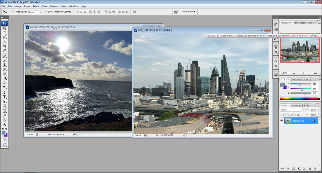
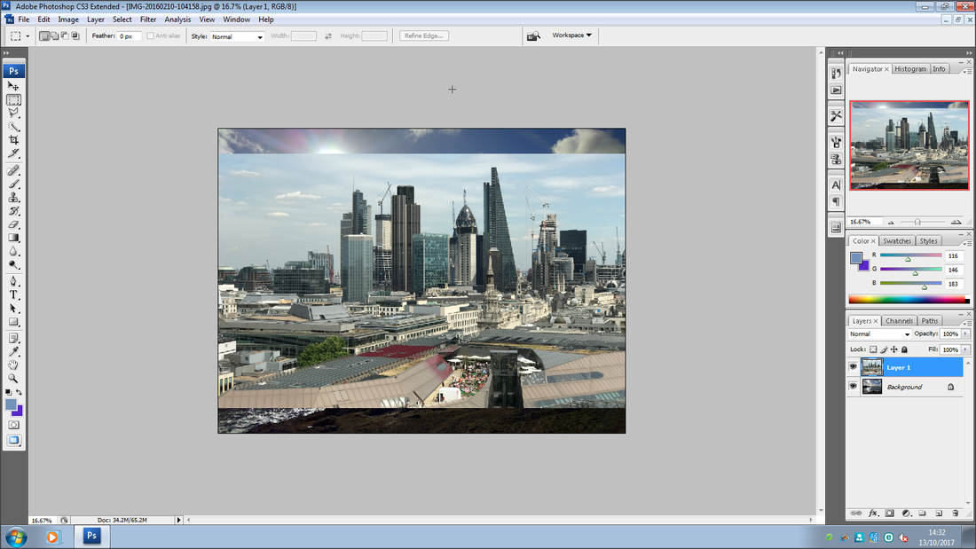
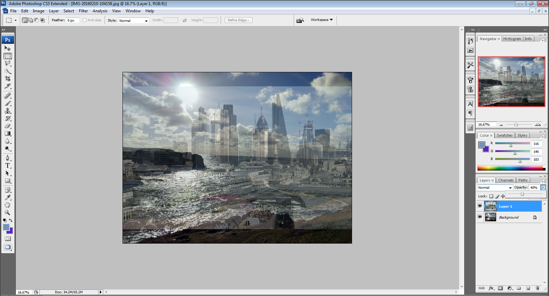
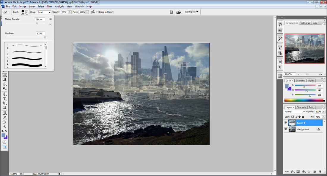
For this photo I decided to experiment using layers. This combines two different photos together to make it look like it's just one photo. I decided to play around with this idea and to combine seascape and Landscape into one photo. My idea initially was to use the picture I had taken in Anglesey as a backdrop and in the horizon use the photo I had taken of a landscape so you can see the city buildings in the horizon and I feel I have achieved this outcome successfully.
To create this photo I started with the photo I had taken in Anglesey. This would be the base photo. Next I opened up the London photo I had taken in a separate window. I used the Lasso tool to cut out all the relevant details I needed and I dragged this onto the Anglesey photo. I adjusted the photo so it matched up with the horizon. The problem I faced then was it looked like it wasn't in the horizon as it was a solid photo and it did not really carry that 'fading' effect. I knew to get the fading effect I had to change the opacity. So I changed the Opacity to about 30% so the photo was more transparent, and this gave me fading effect I wanted.
Personally I am happy with the outcome of this photo. Initially I did not know what to expect as the photo was initially an experiment, but in my mind I had an outcome and vision. After playing around for a while I managed to make my outcome happen and I am happy with how this photo turned out.
linking paragraph
Now that I have been to Anglesey I believe that I have enough photos that I can contrast and compare to urban landscapes. My Anglesey photos are very similar to my artist research, this portrays that I can evaluate his style of work and use it to manipulate my own photos in the same type of style. I feel gathering a range of different photos from Anglesey will help me compare a different variety of urban landscape shots to show the difference and similarities of the two.
LONDON
artist research - paul shears
Paul Shears is based in London/Essex and does not do photography for a living, it is his hobby. Photography has always been a big interest in his day to day life. His grandfather was a photographer and it was his photos that drew his interest into him pursuing photography as a hobby.
I feel with this project I can take inspiration from Paul Shears' photographs, as we share the same style of photos. Much like him I prefer a very clean, clear style of photos. I have decided this time I want to delve into viewpoints and angles, with a black and white filter to make my photos more elegant and exquisite.
Using angles, viewpoints and composition caters very nicely for me. What I find compelling about photography for me is the type that involves a challenge, not just a point and shoot. I prefer to use brain power and meticulously think about angles, perspectives, symmetry and context. I aim to have a meaning behind every photo, people may not see it, but every photo I take has a purpose behind it and is made for a specific reason to provoke a certain emotion or portray a certain environment
Most of all I am attentive in using angles in my photos in this project on viewpoints and perspectives, it adds a certain flair to photos that is not achievable elsewhere. Lines at the sides of buildings catch my attention as they are a vanishing point, you follow them with your eyes until all of a sudden that line disappears, and that's what I want to focus on in this project.
PaUL Shears - photos


Paul Shear - favourite photo

This is my favourite photo taken by Paul Shear. It is taken in the perspective of a worms eye view of two skyscrapers in conjunction with each other with a street light drooping down from above. The worms eye view assist the viewer in witnessing the true immensity of the two skyscrapers. The photographer uses a black and white filter to obscure the irrelevant details so the use of shapes, angles and compositions is more palpable to the viewer.
Paul shear over exposes the photo to empathise the sky, making it pure white so the edges of the building are more visible and they disappear into a vanishing point. The uses of shapes and angles are very potent and they attract the viewers attention. The viewer's attention is focused on the edges of the building, and the effect of this is your eyes naturally follows the edges into the vanishing point.
Personally I find this photo to be eminently appealing for me. The use of perspective, composition and angles in conjunction help to make the photo be distinct. The decision to use a black and white filter helps your eyes to engage on the use of shapes and vanishing points and it filters out the irrelevant details.
artist research - berenice abbot
Berenice Abbot was born on July 17, 1898 and passed away on December 9, 1991. She was an American photographer best known for her portraits of the world wars, and her New York City photographs of architecture and urban design of the 1930s. Berenice Abbots Philosophy was "photography can never grow up if it imitates some other medium. It has to walk one; it has to be itself;
I chose to research Bernice Abbot as I want my work to span over a series of timescales, so it's not all just photographers taking pictures in a modern 21st century. I want to challenge myself to work in a mind-set of a photographer from a different timescale and society. Bernice Abbots photos work very will with my style of photos, classy, clean and consistent. This is why I chose her as I feel that I can mimic her style of photos to a high level of understanding.
I chose to research Bernice Abbot as I want my work to span over a series of timescales, so it's not all just photographers taking pictures in a modern 21st century. I want to challenge myself to work in a mind-set of a photographer from a different timescale and society. Bernice Abbots photos work very will with my style of photos, classy, clean and consistent. This is why I chose her as I feel that I can mimic her style of photos to a high level of understanding.
Brenice abbot - photos


Bernice abbot -Favourite photo

This is my favourite photo of Berenice Abbot. The explicit use of angles and perspective makes the photo enticing for the viewer and attracts the watchers attention. The photo is aimed to exhibit and acquaint the viewer about architecture and textiles in New York over the decade of the 1930s.
The use of perspective helps to depict the volume of the skyscraper and make the viewer apprehend the incisiveness of the architecture of the era. The use of placing the three buildings in conjunction to each other is that it creates a 'tunnel effect.' The three buildings represent the tunnel and the glow from the sky is the light at the end of the tunnel. This assists in making the photograph alluring to the viewer and creates a sense of meaning to the photograph. The black and white filter used in the photograph obscures the irrelevant details, making the viewers attention locked onto the focal point of the photograph, which is the 'tunnel effect.'
Personally I portray a great amount of adulation to this photo, as personally I find it to have a great sense of class and complexity. Using the effect of angles and perspective adds intricacy to the photo making it hard to recreate such an elegant and intelligent photo.
artist research - len grant
Len Grant is a photographer who was born and raised in Manchester. He tells stories with photos, sketches and with words.
His photos are quite architecture based, although he heavily influences his work about giving a voice to the people that are never heard such as asylum seekers, homeless, recovering addicts and those who are on a very low income, all still based in Manchester.
His photos are quite architecture based, although he heavily influences his work about giving a voice to the people that are never heard such as asylum seekers, homeless, recovering addicts and those who are on a very low income, all still based in Manchester.


Linking paragraph
I have decided for urban photography to follow the style of Berenice Abbot. I am interested in this style of photographer because my photos are very similar to that of Berenice Abbot. What I like about her photographs is that it is very simple yet effective and it has a style of class compared to a theme such as pop art. I feel that I can relate more to a classical type of photography. Berenice Abbots photos focus on things we see everyday such as architecture and incorporates it into something that has a sense of class and elegance.
To improve my work and portray progression and skill, I need to go into central Manchester and capture pictures of architecture using various viewpoints and perspectives. This allow me to have greater access to photos to manipulate in Photoshop and work in the style of Berenice Abbot.
BERENICE ABBOT - gallery


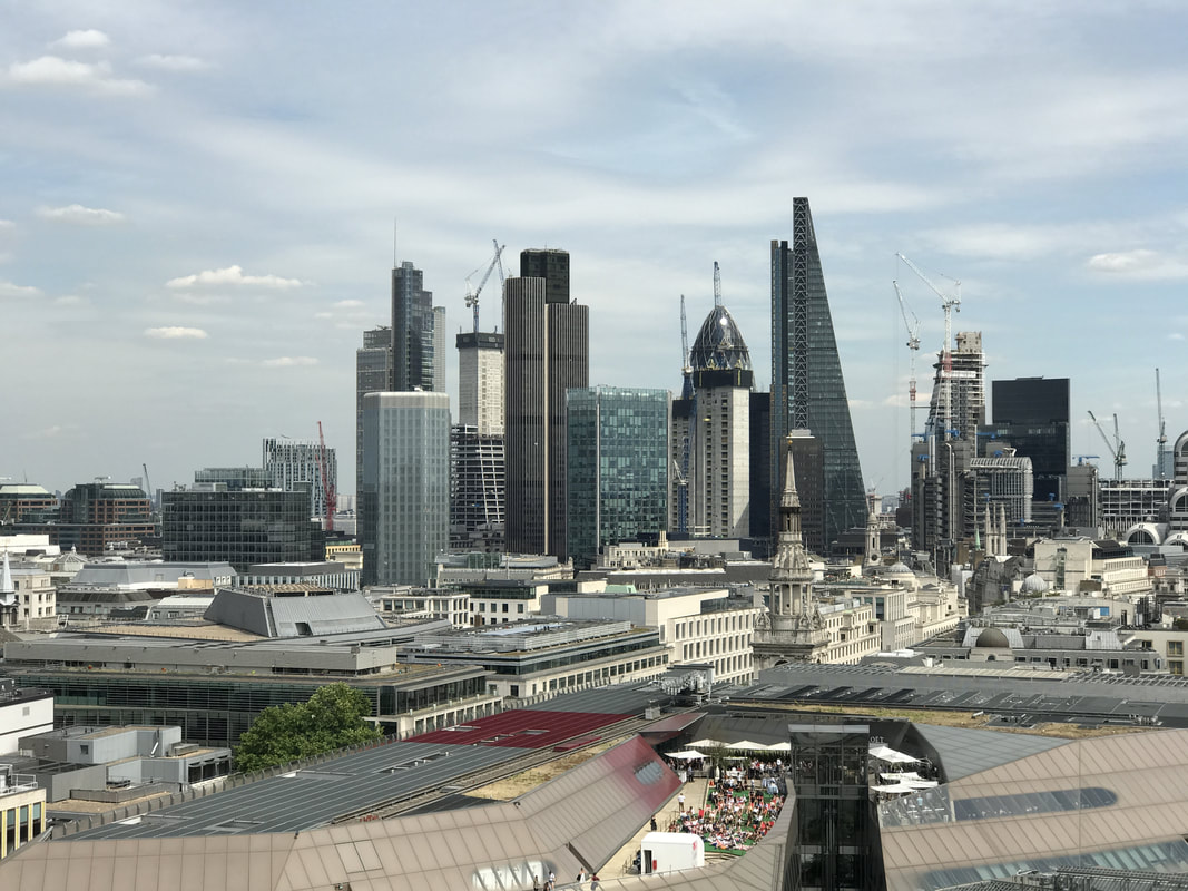
MY london photos
skyline
PAUL SHEARS ME

|

|


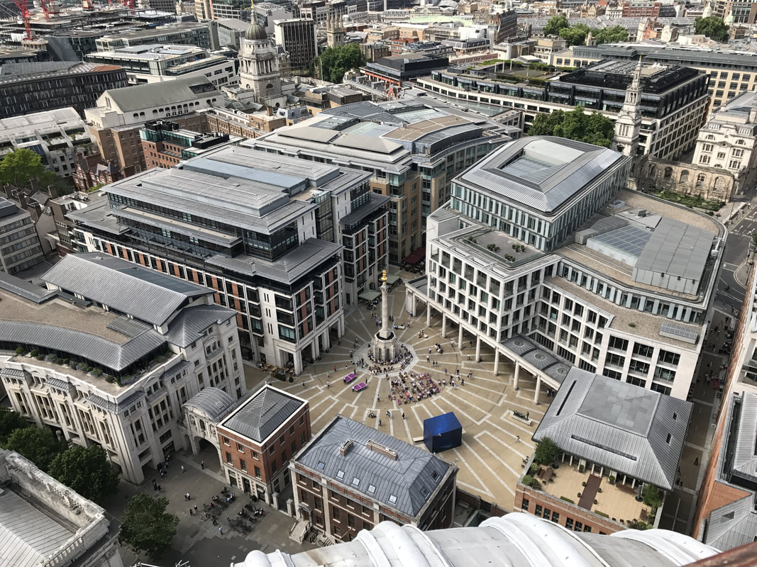
BIRDS EYE VIEW
JASON HAWKES ME

|
|


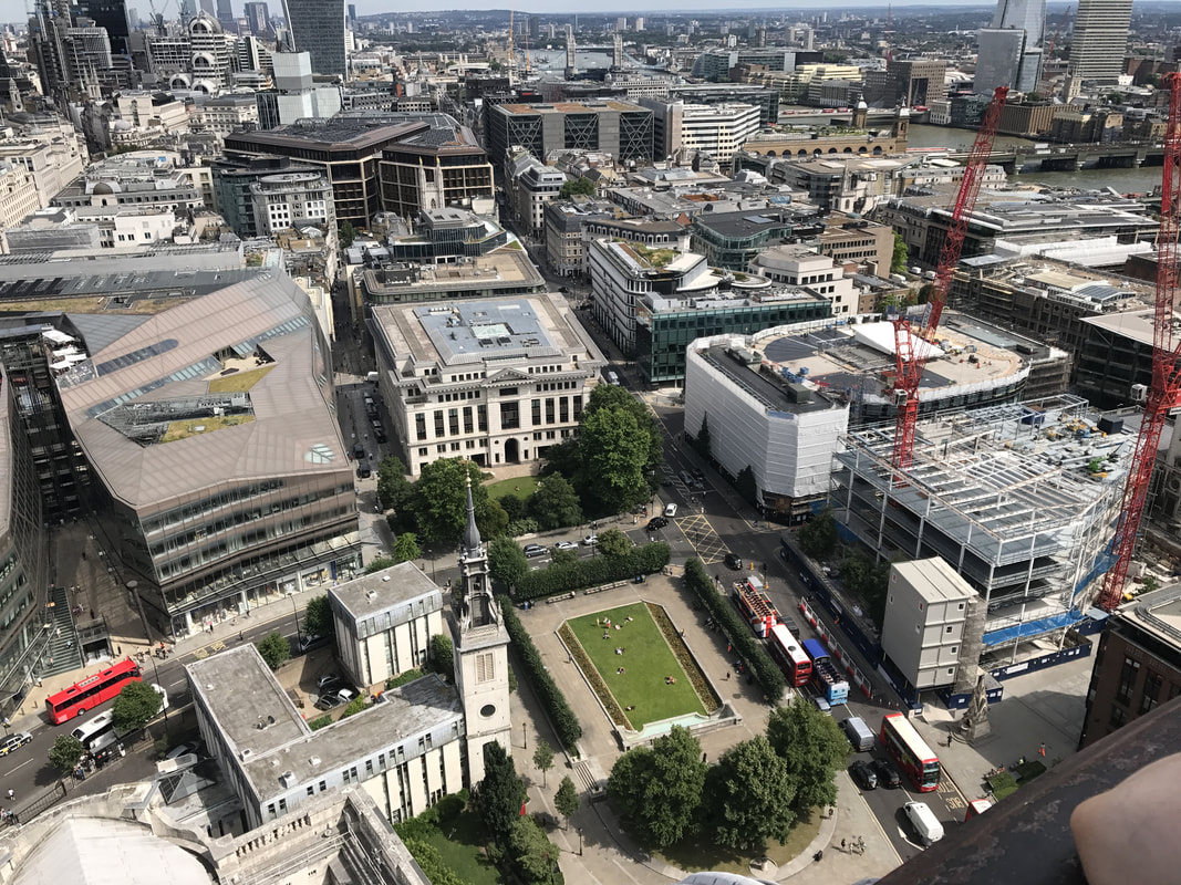
viewpoints


ARCHITECTURE
Len grant ME

|

|


The best of blaCK AND WHITE
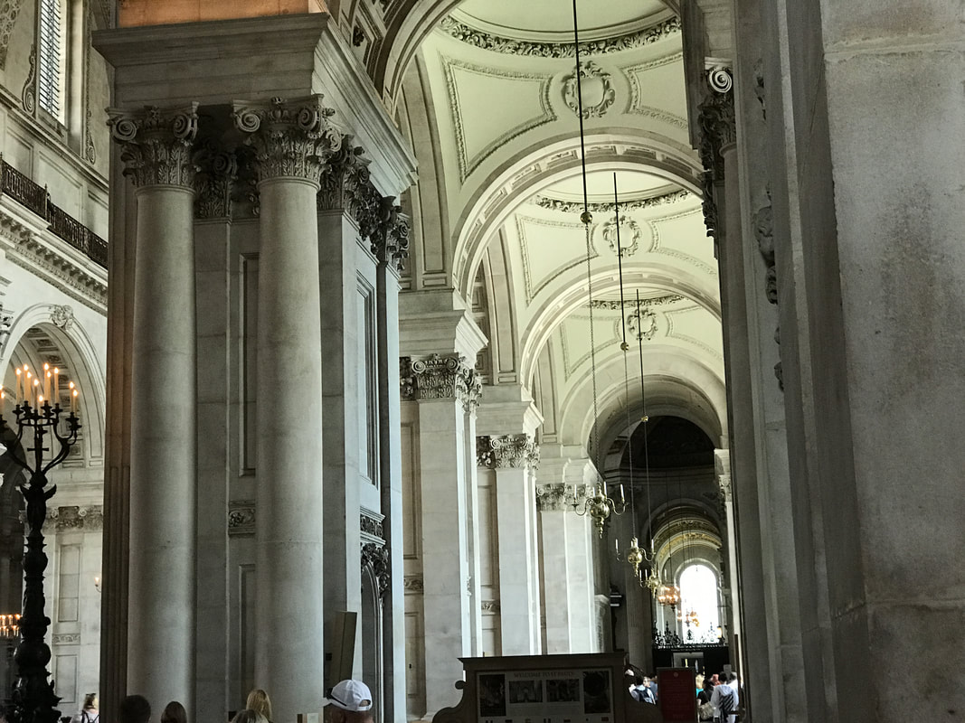
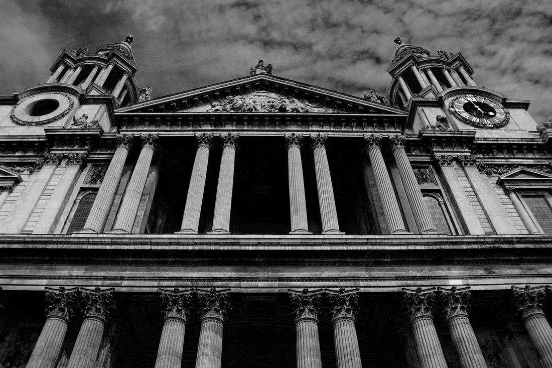
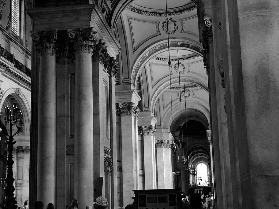
ST paul worms eye view


ST PAUL - FINAL

why did I choose this photo?
I chose this photo because I love the perspective it was taken at. I took this photo in a worms eye view looking upwards to portray my knowledge of different viewpoints. I also like this photo because it has a lot of symmetry, the two clock towers are directly symmetrical and so are all the pillars. This photo looms particularly good in black and white as it gives it a sort of 'spooky' and supernatural feeling with the cathedral and the doomy clouds hanging overhead.
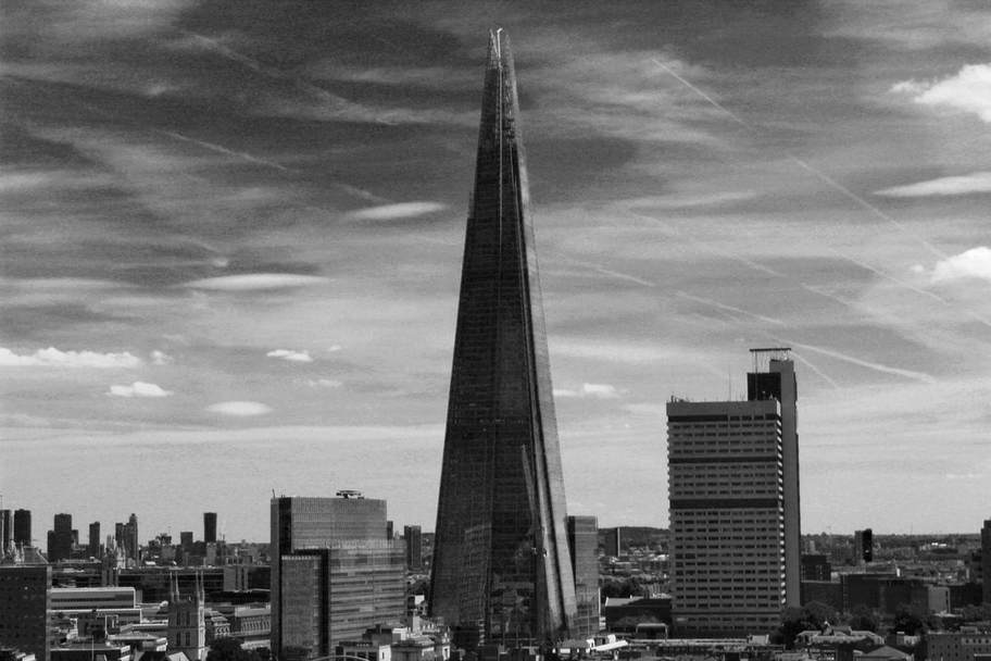
THE SHARD


the shard - final

why did I choose this photo?
I chose this photo because I loved portraying the true height and scale of the shard. I did this by showing it next to a big apartment block so you can see the true scale and intensity of the shard. By making the photo black and white I realised that more details of the sky shown through such as aeroplane lines and the clouds. The photo also has a grainy look so it looks old fashioned and looks like it wasn't something taken in this decade.
PAUL SHEARS REPLICA


PAUL SHEARS REPLICA - final

WHY DID I CHOOSE THIS PHOTO?
I chose this photo as I personally wanted to recreate the photo of Paul shears. I feel I have immaculately done this. I wanted to portray I was working in the style of my chosen photographer and I managed to recreate the photo. I used a black and white filter as it follows my theme and I like this picture because it is clean, simplistic and elegant.
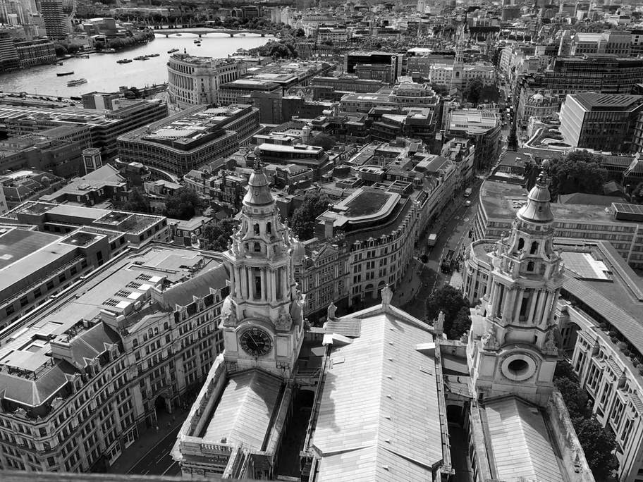
clock tower


clock tower final image

WHy did I choose this photo?
I chose this photo as personally I believe this is one of the best photos I took. It uses composition and the rule of thirds perfectly to get a skyline image. The photo itself has obvious focus points such as the clock tower and how the buildings twist and turn in the formation of the road. This photo looks exceptional in black and white as it adds a sense of class and etiquette to it compared to leaving it in colour. I am very pleased with how this photo turned out and it is one of my personal favourites.
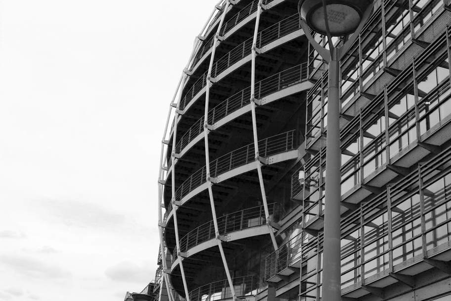
Curved building


curved building final

why did I choose this photo?
I chose this photo in particular because of how well composed it is. The photo matches up perfectly with the rule of thirds and is well framed. The photo also contains unique architecture that makes it stand out. The curved building is the true focus point of the photo with the bright white sky in the background. The photo looked better in black and white as it hides the irrelevant details and the main focus point is now the building.
ST PAUL INTERIOR


st paul interior final

WHY DID I CHOOSE THIS PHOTO?
I chose this photo because of the class and etiquette it carries. I believe this photo carries great class and style that is to a professional level. The photo is well composed following the rule of thirds. The photo looks very 'old fashioned' but carries that classic gothic style that is associated with many churches. The black and white theme helps to aid this as it helps to avoid all the unnecessary details so the focus point is on all the patterns and the lanterns dangling from the roof.
LONDON FINAL PORTFOLIO


LONDON Evaluation
Over the course of the London Project I have conscientiously driven my trait of photos in a certain outlook in order to achieve my chosen theme. I feel I have unequivocally achieved my outcome I proposed for London. I desired to follow a strict black and white theme, keeping my photos simplistic and clear, yet they have a sense of class and etiquette. I feel by taking very explicit photos and using a black and white configuration in Photoshop this has allowed me to achieve my proposed outcome.
The London project has allowed me attain a variety of skills. Firstly I have gained knowledge in how to take clean, simplistic photos that are very effective and portray a clear style, theme and message. I may have already acquired this skill before the London project, but personally I feel this project has allowed me to brush up my skills and add a flair and etiquette to my photos. Secondly I was able to advance my skills in Photoshop by getting extensive knowledge of creating reproducible black and white images that is a common theme throughout all my images in the London project.
Manchester
The Manchester project is going to be the embodiment of everything I aim to achieve in the project 'Landscapes.' In this project I will advance on what I originally aimed to provide; a classy, simplistic style that portrays my understanding of what makes photographs unique and presentable. I am pleasured to take upon this project and I am ecstatic to be able to evolve and portray my final outcomes and glare upon the progress I have made throughout this project and how I have carved my own direction and chose my own theme, flair and style. I am to stay on the theme of black and white with a simplistic style of photographs that still exhibit a level of skill and progression. I aim to go further beyond this by experimenting with time lapses to further evolve my skillset in different areas of photography and videography.
In reference to artists and photographers I plan to remain with the likes of Berenice Abbot and Paul Shears. I am heavily influenced by these two characters therefore I aim to remain in their path and cater towards their style and genre. Generally I will add my own flair and style to the photos I personally take so they suit my personal needs and so I am happy with the type of photographs I am taking. I will compare my own photos to those of Berenice Abbots and Paul Shears to portray how I am working in their style and to reveal skill in how I can intimately create reproducible photographs that are in their style and theme and personally I believe by doing this I will achieve my chosen outcome and I will be able to have the level of skill and progression I am aiming to achieve.
In reference to artists and photographers I plan to remain with the likes of Berenice Abbot and Paul Shears. I am heavily influenced by these two characters therefore I aim to remain in their path and cater towards their style and genre. Generally I will add my own flair and style to the photos I personally take so they suit my personal needs and so I am happy with the type of photographs I am taking. I will compare my own photos to those of Berenice Abbots and Paul Shears to portray how I am working in their style and to reveal skill in how I can intimately create reproducible photographs that are in their style and theme and personally I believe by doing this I will achieve my chosen outcome and I will be able to have the level of skill and progression I am aiming to achieve.
MANCHESTER PROJECT PHOTOSHOOT (GROUPED)
ARCHITECHTURE


vIEWPOINTS
Berenice me

|

|


WORMS EYE


nature


CONSTRUCTION
LEN GRANT me

|

|


INTERIOR


The BEST OF MANCHESTER - Photoshop EDITS
symmetry Building


symmetry building final

WHY DID I CHOOSE THIS PHOTO?
I chose this photo because it is my favourite photo I have taken in the Manchester project, It is the pinnacle and the embodiment of my photography style. The photo is perfectly composed, elegantly portraying the symmetry in the architecture. It follows the rule of thirds and uses the perfect mix of composition and perspective. The black and white filter aids the picture to stand out perfectly against the paper white sky.
STALLION.


stallion final

WHY DID I CHOOSE THIS PHOTO?
I chose this photo in particular as it spoke to me. It carries a message. Often us as humans forget that animals just like us carry feelings - they're living too. You can interpret this photo in multiple ways. Cruelty? Fairness? Often the best photographs are those that carry a message, a true meaning. I feel this shows a higher level of skill as you can turn a photograph into a story other than it just being an inanimate thing. I feel I have perfectly achieved this in this photo and that's why I picked this photo in particular.
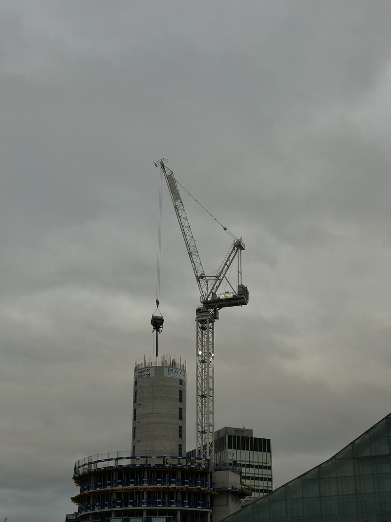
THE CRANE


THE CRANE FINAL

WHY DID I CHOOSE THIS PHOTO?
I chose this photo as when researching Len Grant I became particularly interested in his construction photoshoots. The idea of these cranes that lurk high in the sky and these are pinnacle for modern construction. Many of these high rise building would seize to exist without these solid metal cranes that lurk in the skies. The black and white filter helps to show the true scale of these giant skyscrapers and how they wander within the skies.
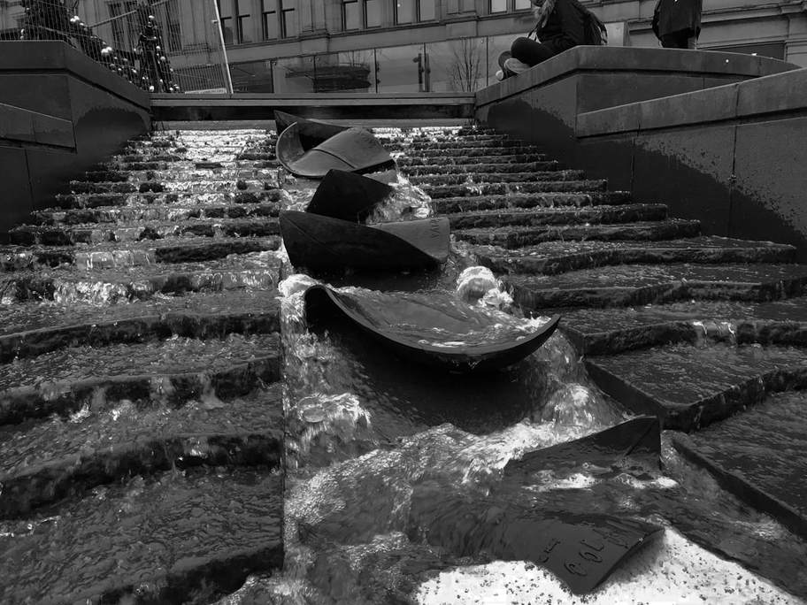
FLOW


FLOW FINAL

WHY DID I CHOOSE THIS PHOTO?
I chose this photo because personally I believe it is a very clean, simplistic and symmetrical photo. The photo uses the rule of thirds perfectly to line up the flow of water. I personally like the use of the black and white filter in this photograph as the concrete the water flows down is dark compared to the lightness of the water so it aids it in standing out and it grabs the viewers attention.
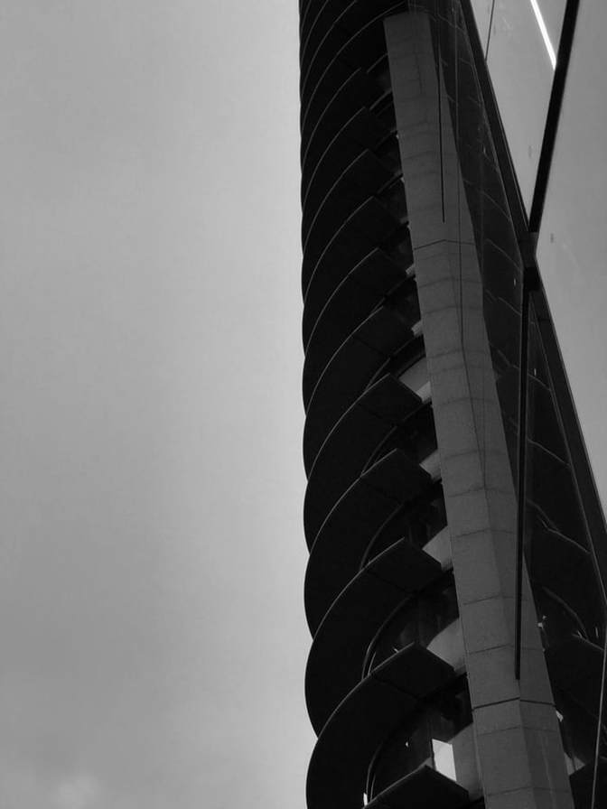
SIDE SPIRAL


SIDE SPIRAL FINAL

WHY DID I CHOOSE THIS PHOTO?
I chose this photo as it is very simple, clean and classy. It embodies my style of photography perfectly in how a picture can very simple yet very effective. I managed to get the sky to be a monotone grey by adjusting cyan and blues to -200 to cancel out any other colours in the sky. This is good as it helps to contrast with the spiral as the focus point is the infinite ascending spirals that are in fact on a power spot and perfectly composed by using the rule of thirds. Personally this one of my favourite pictures as I love the simplistic yet it has a etiquette and flair to the photograph.
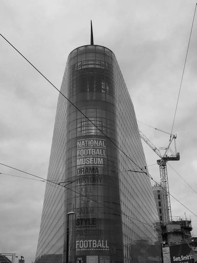
FOOTBALL MUSEUM


Football museum final

WHY DID I CHOOSE This photo?
A main reason for choosing this photo was the interest in the architecture. The football museum is very unique and if you stand where I did you can see how both sides are symmetrical and how they vanish into the background. Having the photo in black and white is particularly interesting as it makes it look gloomy and how the building is very dominant and overshadowing and the building in general is very interesting and it was worth me choosing it.
SPIRAL


spiral final

why did i choose this photo?
I found this photo in particular interesting as it has so many shapes and therefore there are so many focus points. These is the overarching spiral. the combination of triangles, the ascending rectangles, there is an endless amount of shapes. Upon editing I had a clear vison in my mind; I want to make this photo as monotone as possible. By doing this I have made a very clear contrast and the picture retains a classy, simplistic look.
PRINTWORKS


PRintworks final

why did i choose this photo?
This is my second favourite photo I have taken in the Manchester Project. I like this photo in particular as it is well composed, the focus point is on all the various logos. The architecture on this building particularly is very interesting as it is not modern in no shape or form, it has that 80's look that I think is very appealing. When editing I bumped up the colours of yellows, cyan and reds so the logos stand out as they are the focus point of the picture.
TIME LAPSES
In order to stretch my outcomes I gave decided to create a series of time lapses. These will portray my greater depth and understanding of various types of photography and videography. I filmed a series of time lapses on the tram to Manchester's city centre that I will edit and combine together. I also made a time-lapse of people walking through Market Street and I aimed the congestion and mayhem of a city centre.
THE TRAM JOURNEY - PROCESS


TRAM JOURNEY TIME LAPSE
Personally I am happy with the outcome of this time lapse. Initially I'm planned two just combine all the videos together with music in the background, but I started experimenting with animations and effects, and I realised I can show a much greater skillset if i incorporate them into the time-lapse. What I first did was open up the time lapse sequentially so all the videos were in order. I then clicked the option to add music, and I adjusted the soundtrack I just downloaded so it was in sync with the video. After this I discovered animations, and I figured out the idea of having the effect change every time there was an animation. After every so often if necessary I would split the video so I can add a new animation and effect. Lastly I included credits that shown the location of where the time lapses took place.
MANCHESTER MAYHEM - PROGRESS


MANCHESTER MAYHEM TIME LAPSE
Using the same skills I learned for the tram journey time lapse, I incorporated the same theme and skills into this time lapse showing the movement of people and trams across Market Street. Like the last time lapse, I am very happy with the outcome and I feel this has stretched my final outcomes significantly, as I have portrayed a range of skillsets and a depth of knowledge in videography and photography techniques.
LANDSCAPES - FINAL PORTFOLIO
ANGLESEY

LONDON


MAnchester


FINAL PORTFOLIO COLLAGE

Final EVALUATION
The project theme we were tasked with is 'Landscapes.' Initially my mind was vacant, but over time I carved my own path and direction in the style I wanted to portray in my photographs and the theme I wanted to follow right until the end. At first I didn't seem to like the project too much, particularly as Seascapes do not cater to my style and agenda, but I found my ground when we moved onto urban landscapes and my ideas began to shine as you can see in the London and the Manchester project I gained photos that had a sense of class and etiquette. I began to cater my photographs to suit my own personal needs while still being relevant to the task at hand.
My favoured part of the project was the London shoot. From their I began to carve my style and direction, producing photographs to a professional level that had a sense of class, simplicity, flair and etiquette. The black and white theme I had chose catered well to me as I could allow my photos to have class as densely colourful photos did not suit my agenda. I feel I had evolved and enhanced my skillset greatly as I adapted to different styles, themes and genres. By the time we had moved to the Manchester project I had a clear vision, theme and direction that I pursued and it has enhanced and evolved my skillsets greatly over the course of the project.
This project has allowed me to obtain a variety of skills. The pinnacle of skills and the pinnacle of my success in this project would be my enhanced skill in style and class, as I evolved my photos to be simplistic yet very effective, my photos have a meaning and a reasoning, not just an inanimate thing my photographs are able to provoke thoughts in the mind of the viewer. I was able to constantly create reproducible black and white images to that of a professional standard. I also had the opportunity to grow and enhance my videography skills, creating two time lapses using various skills such as adding music, animations and effects into the time lapse itself. I feel these skills aided me in lengthening my outcomes as I was able to cater to different preferences and genres. The project overall guided my camera and Photoshop skills and enhancing them to a professional standard that allowed me to stretch my outcomes.
My three main researched photographers were Len Grant, Berenice Abbot and Paul Shears. I was deeply influenced by the likes of these characters , as they evoked my interest in simplistic, classy yet effective photographs. I had the opportunity in recreating the photographs of Paul Shear in London, I feel I had recreated them in an immaculate form that was to a commercial standard and were directly similar to like of Paul Shears. In Manchester I was granted the opportunity to be able to reproduce a photo similar to Len Grant, using the theme of construction and capturing cranes lurking in the sky, and I could recreate these photos but still add my own sense of class, flair and etiquette.
The problems I encountered were quite personal and had to do with my character. I set the standards so colossal for myself, anything below 'immaculate' I would not accept therefore at times my portfolio was lackluster and needed more photos, even if the ones I had were still to a very professional standard. To combat this I needed to accept that not all my photos are going to be absolutely immaculate all the time, and I have had to accept this even if that means posting photos that I see below acceptable. On the other hand this has also worked to my advantage, as I was able to get photos to the very highest of standards as I set the bar very high for myself.
Overall I grew to become very fond with this project, it enhanced and widened my skillset and I have learned various camera and Photoshop techniques, as well as videography techniques by using time lapses. I do not regret any decisions I have made in this project, as I see my photos are of the highest of standards and they all have a sense of class and etiquette.
